Painting realistic skin tones is one of the most important and rewarding skills for any digital artist. Skin is complex, it reflects light, shows subtle color changes, and carries texture that makes people look alive. Whether you’re working on portraits, characters, or illustrations, understanding how to create lifelike skin tones will dramatically improve your art.
In this guide, we’ll break down everything you need to know step-by-step, with clear examples and practical tips. Even if you’re a beginner, you’ll find it easy to follow and apply.
Why Realistic Skin Tones Matter
Skin is one of the first things people notice in artwork featuring humans. Realistic skin tones help:
- Bring characters to life: Skin color affects how warm, healthy, or expressive your characters appear.
- Show light and atmosphere: Skin tone changes depending on lighting and environment.
- Create mood: Warm or cool skin tones can make a scene feel cozy, dramatic, or mysterious.
- Add depth: Skin tone variations show the shape and contours of the face and body.
Without attention to skin tones, your artwork may feel flat or lifeless. But with the right techniques, you can make skin look vibrant, natural, and three-dimensional.
1. Understand the Base Skin Color
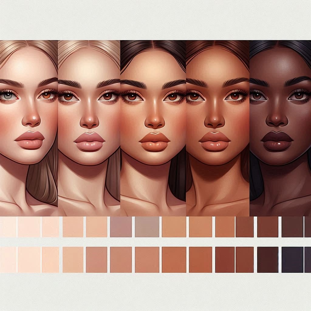
Every skin tone starts with a base color, a middle ground between light and dark. This base is what you build on with shadows and highlights.
- What does a base color look like?
It’s usually a warm peachy, yellow, or brownish tone, but not pure red or bright orange. Pure reds or browns look unnatural if used as a base. - How to find your base color?
Use photo references of people with similar skin tones or pick from color palettes online. Start with a simple mid-tone color that is not too bright or dark. - Why not pure red or brown?
Real skin has subtle undertones of reds, yellows, blues, and even greens. Pure reds can make skin look angry or unhealthy, and pure browns can make it look dull.
Tip: Use the color picker tool on a good-quality photo reference to find the perfect base tone.
2. Consider the Lighting and Environment
Skin tone looks different depending on where the light comes from and what kind of light it is.
- Warm light (like sunlight or indoor lamps):
Adds golden, orange, or pinkish hues to the skin. Shadows may appear cooler in contrast. - Cool light (like moonlight or shade):
Adds bluish or greenish tones to skin and shadows. - Why does light affect skin color so much?
Skin reflects the light around it. If a character stands next to a red wall, for example, you may see a subtle red glow on the skin.
Remember: Consistency is key. Make sure all shadows and highlights follow the same light source.
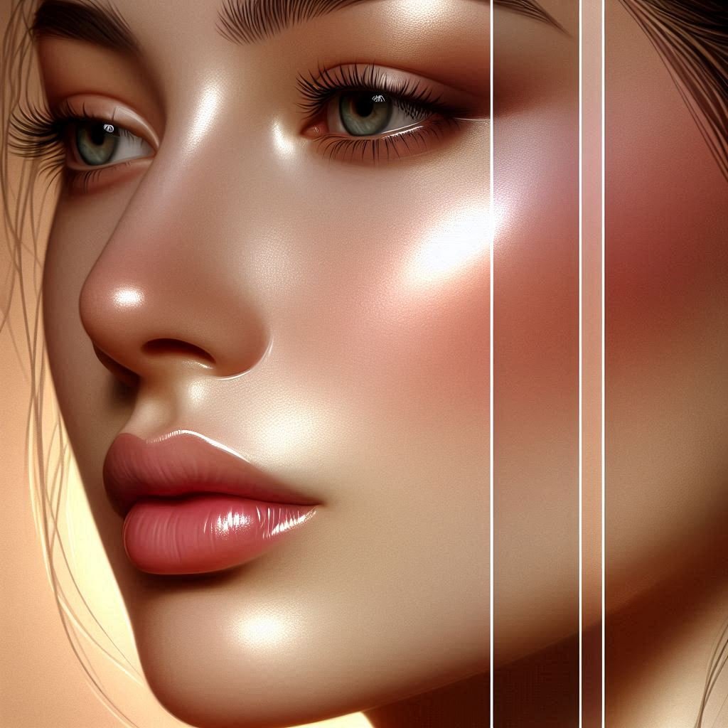
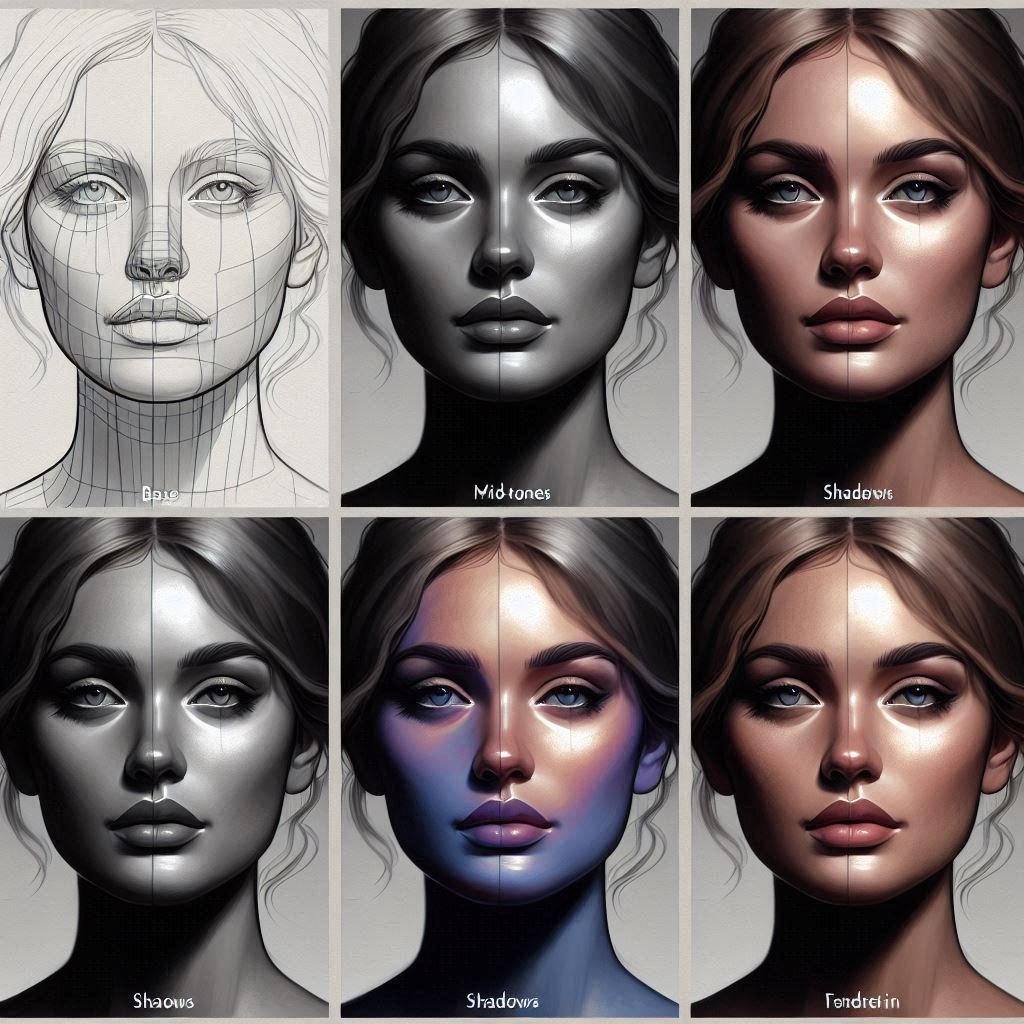
3. Layer Your Colors for Depth
Skin isn’t a flat color, it has layers of tones.
- Start with your base layer: This is your mid-tone skin color.
- Add shadows: Use a slightly darker, cooler color. Don’t just use black or gray shadows; real shadows on skin often have color.
- Add highlights: Use a lighter, warmer color to show where light hits the skin.
- Use blending modes: Programs like Photoshop or Procreate let you set layers to Multiply (for shadows) or Screen/Overlay (for highlights) to create natural-looking depth.
- Why layers?
Layers let you adjust shadows and highlights separately without damaging your base color. You can tweak them easily to get just the right look.
4. Use Color Variation and Texture
Skin is never one single color, there are subtle changes everywhere:
- Redness: Areas like cheeks, nose tip, and lips often have more red or pink.
- Cooler areas: The jawline, under the eyes, or neck may have cooler, bluish or purple tones.
- Small details: Freckles, moles, or tiny veins add realism.
- Texture: Skin has pores and fine lines that catch light differently. Using a slightly rough or speckled brush helps mimic this texture.
Tip: Avoid smooth, flat colors. Break up smooth areas with tiny changes in hue and value to make skin feel alive.
5. Blend Thoughtfully
Blending is smoothing out transitions between colors and shades, but too much blending can make skin look unnatural.
- Use soft brushes at low opacity to gently mix colors.
- Use textured brushes to keep the natural roughness of skin.
- Zoom in and paint carefully around details like nostrils, lips, and eyes.
- Step back frequently to check if the skin looks natural or too “plastic.”
6. Study Real References and Practice
The best way to improve is by observing real skin:
- Use high-resolution photos in different lighting situations.
- Study how shadows fall on the face and how colors shift with light.
- Try black and white sketches first to understand light and shadow without color distractions.
- Practice regularly with quick sketches focusing only on skin tones.
7. Common Mistakes to Avoid
- Using pure black or white for shadows and highlights: Real skin shadows are colored and highlights are soft.
- Overblending: Makes skin look smooth and fake.
- Ignoring reflected light: Shadows often have subtle colors from surrounding objects.
- Picking the wrong base color: Start with a neutral mid-tone, not extremes.
8. Tools and Resources
- Brushes: Soft round brushes for blending, textured brushes for skin details.
- Software: Procreate, Photoshop, Clip Studio Paint, Krita all have great tools.
- Color pickers: Sample colors directly from reference photos.
- Palette generators: Online tools to create harmonious skin tone palettes.
9. Link to Your Other Digital Art Techniques
To get the most out of your skin tone painting, check these related guides:
- Mastering Light and Shadow in Digital Art — Light shapes your skin tones!
- Digital Color Theory for Beginners — Learn how colors interact to make your skin vibrant.
- Creating Texture in Digital Art — Add realistic pores and details to your skin.
FAQs: Painting Realistic Skin Tones
Q: How do I pick the right base skin color?
A: Use photo references and avoid extreme reds or browns. Start with a mid-tone and adjust based on lighting.
Q: What brushes are best?
A: Soft brushes for blending, textured brushes for detail work.
Q: How can I make skin look less flat?
A: Add subtle color changes, use shadows and highlights, and add texture.
Q: Should I always use references?
A: Yes! References help you understand real-life color and lighting.
Q: Can I use a limited color palette?
A: Yes. Focus on layering and blending within your chosen colors.
Final Thoughts
Painting realistic skin tones takes patience and observation, but it’s worth it. With these clear steps and regular practice, you’ll see your portraits come alive with warmth, depth, and life. Keep studying light, color, and texture, and enjoy the creative journey!
If you enjoyed this guide, bookmark PictureGate.org and check back for more tutorials and tips in our Digital Art Techniques series!


3 Comments on “Achieve Stunning Realism: Master Painting Skin Tones in Digital Art 2026”
Comments are closed.