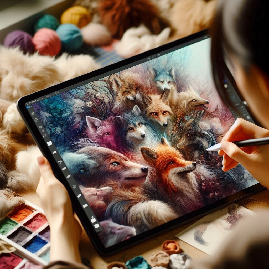
Texture in digital art is the unsung hero. It brings your flat surfaces to life, adds realism, and enhances visual interest. Whether you’re painting cracked stone, soft skin, rough fabric, or metallic surfaces, mastering texture is key to making your digital artwork feel tangible and immersive.
In this guide, we’ll break down what texture in digital art is, why it matters, and how to build it effectively in your digital pieces. Plus, we’ll share pro tips, common mistakes to avoid, and image examples to help you build texture with confidence.
Why Texture in Digital Art Matters?
Texture does more than decorate a surface, it communicates material, age, emotion, and atmosphere. Here’s what strong texturing can do:
- Add realism: Texture helps objects feel solid and grounded.
- Enhance mood: Rough textures evoke tension; smooth ones calm the eye.
- Tell a story: A worn leather boot says more than a flat brown shape.
- Improve composition: Textured areas contrast nicely with smoother ones, adding rhythm to your piece.
🎨 Want your highlights and shadows to enhance texture? Read our post on Mastering Light and Shadow in Digital Art.
Types of Texture in Digital Art
Before you dive into techniques, it’s important to understand two major categories of texture:
A. Visual Texture
This is the illusion of texture, painted details that make something look rough, smooth, soft, or hard. It’s 2D but looks 3D.
B. Tactile (Simulated) Texture
Created with brushes, overlays, and texture maps. Even though we can’t feel it, these elements give the illusion of touch.
Understanding both allows you to choose whether you want a hyper-detailed, photo-realistic style or a stylized, painterly look.
Building Texture in Digital Art with Brushes
Brush choice plays a massive role in creating texture. The good news? Most digital art programs offer a wide variety of brushes built for texture creation.
🔹 Recommended Brush Types:
- Grainy brushes: Perfect for skin, sand, or stone.
- Dry media brushes: Mimic pencil or chalk textures.
- Splatter brushes: Great for dirt, freckles, or chaos.
- Pattern brushes: For repetitive surfaces like scales or fabrics.
🛠 Tools That Support Texture Work:
- Photoshop: Use textured brushes and pattern overlays.
- Procreate: Use the “Grunge,” “Charcoal,” or custom brush packs.
- Krita: Create your own brushes or download texture packs.
💡 Tip: Start your base layer with a texture brush, then add detail gradually with more controlled tools.
Using Layers and Blend Modes
Texture in digital art shines when built gradually. Don’t try to finish it all on one layer.
Suggested Workflow:
- Base color – flat fill of the object.
- Mid-texture – use Multiply or Overlay for layered brushwork.
- Detail texture – use small brushes for wrinkles, cracks, pores.
- Highlight texture in digital art – add surface lighting using Screen or Linear Dodge.
Popular Blend Modes for Texture:
- Multiply – deepens tones for worn or dark surfaces.
- Overlay – adds contrast and boosts color richness.
- Soft Light – subtle texture additions without overpowering.
- Color Dodge – for shiny, reflective textures.
🌟 Want to make texture pop even more? Pair it with proper lighting using our Light and Shadow Guide.
Observation and Reference Are Key
You can’t paint what you haven’t studied.
Use These Observation Tactics:
- Zoom into high-res photos to examine fine textures.
- Photograph your own textures: bricks, leaves, cloth, etc.
- Break it down: Look at texture in terms of direction, density, and contrast.
Best Subjects for Practice:
- Human skin: Smooth with pores and variation.
- Wood grain: Directional, often rough.
- Metal: Smooth but reflects light uniquely.
- Fabric: Depends on material, cotton vs. leather.
👁️ Look closely — texture often appears more in how light reacts than in the surface itself.
Texture Mapping and Overlays
You don’t always have to paint texture by hand. Use texture overlays or texture maps to add complexity to surfaces.
How to Use Overlays:
- Choose a texture photo (fabric, wall, paper, etc.).
- Set it on top of your art layer.
- Change the blend mode (Overlay, Multiply).
- Mask or erase areas to blend naturally.
Caution:
Don’t let overlays do all the work. Blend them in and refine with hand painting so they don’t look slapped on.
Practice Exercises to Master Texture in Digital Art
Start simple, then scale up:
📘 Beginner Exercises:
- Paint a sphere and give it three different textures (metal, stone, skin).
- Texture a cube to resemble wood, with visible grain direction.
- Add freckles and pores to a portrait sketch.
🧪 Intermediate Challenge:
Create one object (e.g. an apple) in 5 different materials: metal, wax, glass, fabric, skin.
Common Mistakes to Avoid
- ❌ Overtexturing: Too much makes your piece look noisy.
- ❌ Repeating patterns: Don’t use one brush stroke over and over.
- ❌ Flat lighting: Texture relies on contrast — get your shadows right.
- ❌ Ignoring scale: Don’t use the same brush for a rock wall and a tiny ring.
Linking Your Artwork to Texture Themes
If you showcase your work online, use galleries and collections to show how texture enhances your pieces.
For example, on PictureGate.org, you’ll find texture in many of our curated image categories:
- Divine Art and Iconography – explore ornate textures in sacred artwork.
- Wellness – observe skin, fabric, and serene natural elements.
- Minimalism – where texture stands out in simplicity.
- Portraits – explore human skin and hair textures.
Feel free to browse and get inspired or use them as visual references!
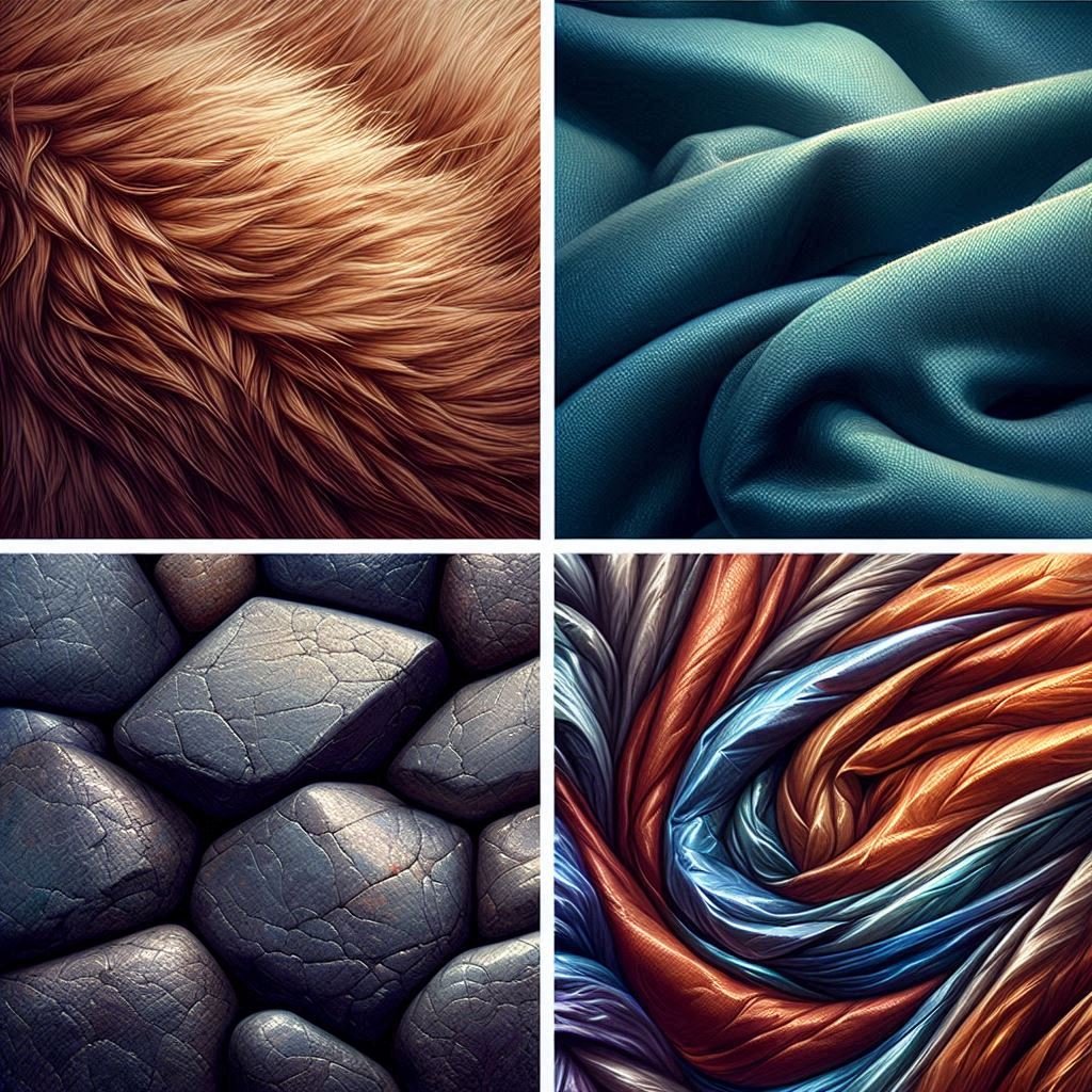
Example of Texture in Digital Art
FAQs:
Q: Do I need to use textured brushes to create texture?
A: Not necessarily. You can create texture in digital art manually through painting technique, but textured brushes help speed up and enhance the process.
Q: How do I know when I’ve added enough texture in digital art?
A: Zoom out. If the surface looks visually interesting and supports your composition without overwhelming it, you’re done.
Q: Can I use photo textures in my digital painting?
A: Yes, as long as they are royalty-free or your own. Blend them in with masks and painting to avoid obvious cut-and-paste looks.
Q: What file resolution is best for detailed texture work?
A: Work at 300 DPI if printing, or at least 2500–3500 pixels wide for web use to retain texture detail.
Q: Should I texture every surface in my artwork?
A: No. Use texture to create contrast and focal interest. Smooth areas help textured ones stand out more.
Conclusion
Texture in digital art may seem like a small detail, but it’s a powerful storytelling tool in digital art. Whether you’re aiming for realism or stylized charm, mastering texture will elevate your work dramatically.
Remember: practice, observe, and experiment. Layer your process gradually, and always keep lighting in mind for the most believable results.
🔗 Related Reading
👉 Mastering Light and Shadow in Digital Art
👉 Painting Realistic Skin Tones and Dynamic Lighting for Action Scenes


2 Comments on “Master Texture in Digital Art 2026: Techniques to Make Your Artwork Pop”