
Color is one of the most powerful tools in digital art. It can create emotion, depth, focus, and visual harmony, all with a few strokes of your stylus. Whether you’re new to digital painting or transitioning from traditional media, understanding digital color theory is essential to creating vibrant, professional-looking artwork.
In this beginner-friendly guide, we’ll cover all the basics of color theory in a way that’s practical, easy to apply, and geared toward digital artists using tools like Photoshop, Procreate, Clip Studio Paint, or Krita.
🎯 Why Digital Color Theory Matters in Art?
Color is more than decoration, it’s visual communication. When used properly, it enhances every aspect of your artwork. Here’s why it matters:
- Mood and Emotion: Colors can evoke different emotional responses. For example, blue can feel calm or sad, red can feel energetic or aggressive.
- Focus and Hierarchy: You can use bright or contrasting colors to highlight the most important parts of your composition.
- Unity and Balance: Harmonious colors make the artwork feel complete and professional.
- Depth and Space: Warm colors tend to come forward, while cool colors recede, creating depth.
A digital artist must know how to manipulate color intentionally to tell a story or convey a concept effectively.
🌈 1. Understanding the Digital Color Wheel
The color wheel is a visual representation of hues arranged in a circle. It helps artists understand relationships between colors.
● Primary Colors
- Red, Blue, Yellow: The base colors that cannot be created by mixing others.
● Secondary Colors
- Orange, Green, Purple: Made by combining two primary colors.
● Tertiary Colors
- Yellow-Orange, Blue-Green, etc.: Made by mixing a primary and a secondary color.
In digital art, we often work with the RGB color model (Red, Green, Blue), which deals with light rather than pigment. RGB is ideal for screen-based artworks.
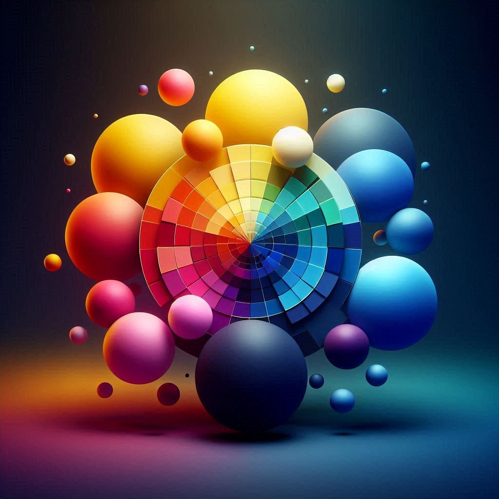
Understanding the digital color wheel allows you to pick hues that naturally work well together and helps prevent clashing color choices.
🖼️ 3. Color Harmonies: Choosing Colors That Work Together
Using color harmonies is a practical way to create visually pleasing compositions. These combinations are based on positions on the color wheel:
▶ Complementary Colors
- Colors directly opposite each other (e.g., blue and orange)
- High contrast, vibrant, great for focal points
▶ Analogous Colors
- Colors next to each other (e.g., red, orange, yellow)
- Harmonious, gentle, and natural
▶ Triadic Colors
- Evenly spaced (e.g., red, yellow, blue)
- Balanced yet vibrant
▶ Monochromatic Colors
- Variations of a single hue with different values and saturation
- Great for mood and simplicity
These harmonies give you a toolkit to craft color palettes quickly and effectively.
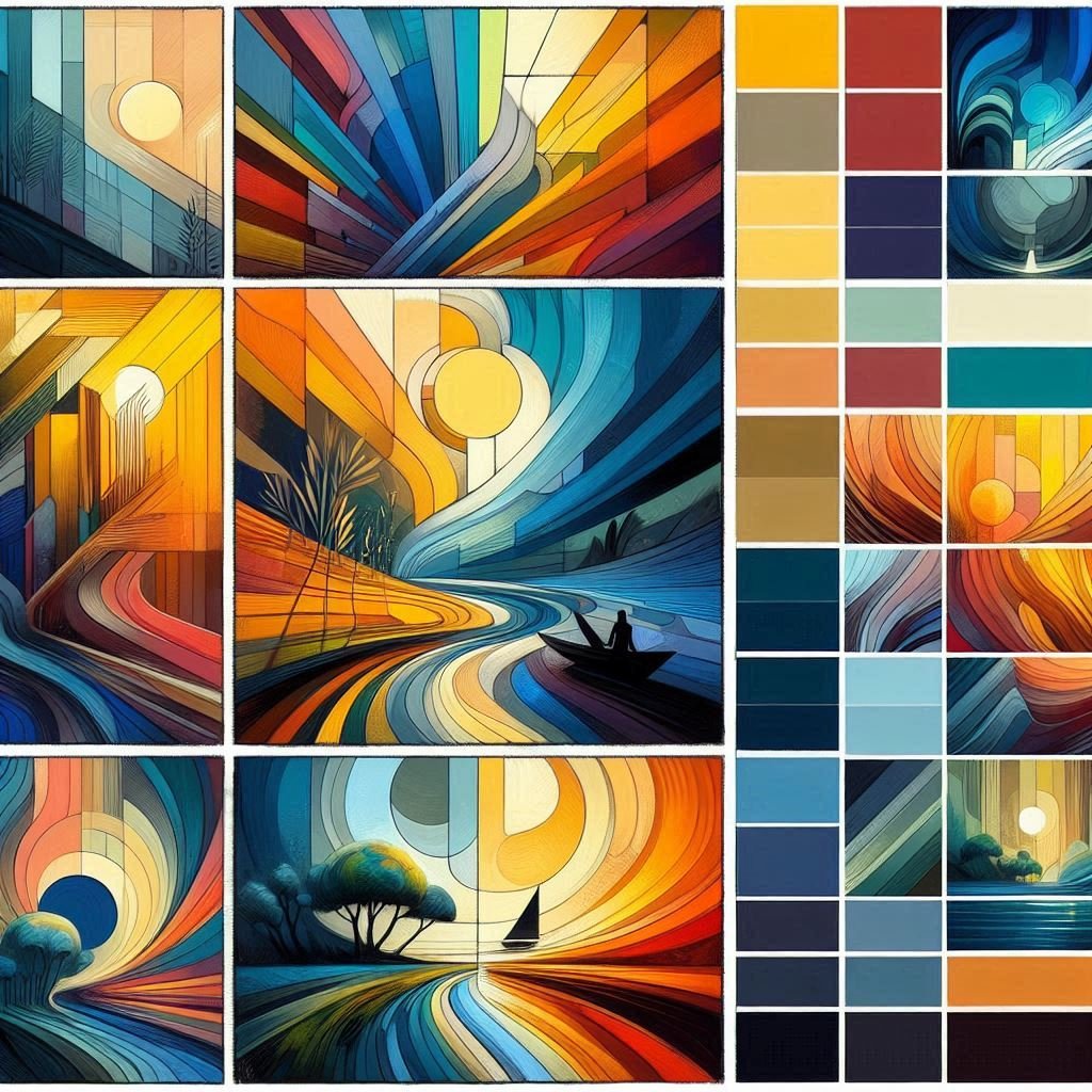
🌡️ 4. Warm vs Cool Colors
Color temperature refers to how warm or cool a color appears, and it’s essential for creating atmosphere and space.
☀️ Warm Colors
- Red, Orange, Yellow
- Feel active, energetic, and attention-grabbing
- Appear to come forward in an image
❄️ Cool Colors
- Blue, Green, Purple
- Feel calm, soothing, and distant
- Recede into the background
Balancing warm and cool tones in your piece can add visual interest and depth. For example, warm light often creates cool shadows and vice versa.
🌗 5. Value and Saturation: Not Just About Hue
Many beginners focus only on color hue, but two other aspects are equally important in digital color theory:
✅ Value
- Refers to how light or dark a color is
- Crucial for defining form, structure, and depth
- A well-planned value scheme allows your artwork to read clearly, even in grayscale
✅ Saturation
- Measures the intensity or purity of a color
- High saturation = bright, vivid colors
- Low saturation = muted, dull tones
Artists should always consider value and saturation when painting. For instance, combining highly saturated focal points with muted backgrounds can direct the viewer’s attention effectively.
🌟 6. Color in Composition: Directing the Eye
Color can be used to guide the viewer through the artwork and establish visual flow.
- Use high contrast colors to bring attention to your focal point
- Repeat colors across the canvas to create unity
- Balance saturated colors with neutrals to avoid overwhelming the viewer
- Cool backgrounds + warm subjects = strong emphasis
Color is a powerful design tool, not just an aesthetic choice.
🛠️ 7. How to Build a Digital Color Palette
Creating a consistent and effective color palette can make or break a piece.
✨ A. From the Color Wheel
Choose a base hue and build with analogous, complementary, or triadic colors. Adjust value and saturation for variety.
✨ B. From References
Use a photo or painting and extract colors using the eyedropper tool to create a palette.
✨ C. Using Online Tools
Try generators like:
🔍 Pro Tip:
Use blending modes like Overlay or Multiply to experiment with how colors interact in your artwork.
❌ 8. Common Beginner Mistakes
Avoid these color pitfalls:
- Using fully saturated colors across the board
- Relying on black or white for shading and highlighting
- Ignoring value and temperature
- Clashing colors due to poor planning
Take time to build your palette and test it in grayscale before you paint. Small steps lead to big improvements.
🖌️ 9. Practice Exercises for Color Mastery
Apply your knowledge with these exercises:
- Create a Monochromatic Piece: Focus on one hue and experiment with value and saturation.
- Use Complementary Colors Only: Create contrast and learn to balance tension.
- Repaint a Scene in Analogous Colors: Observe how mood changes.
- Build a Palette from Nature: Sample colors from a photo of a landscape or flower.
- Grayscale to Color: Start with a grayscale sketch and add color later using layers.
These exercises build your confidence and help solidify your understanding of digital color theory.
🔗 Linking to PictureGate.org Galleries
Want to see color in action? Visit our Portraits Gallery and Minimalism Gallery for real examples of how color choices influence emotion and composition. These curated artworks demonstrate digital color techniques used effectively, from bold contrasts to subtle gradients.
❓ FAQ: Digital Color Theory for Beginners
Q: Do I need to use traditional or digital color theory in digital art?
A: Yes, the fundamentals are still essential, but you can also experiment freely using digital tools.
Q: Should I always use a color palette?
A: It’s recommended for consistency, especially when starting out. Over time, you can trust your eye more.
Q: What’s the best way to get better at using color?
A: Study reference images, replicate master artworks, and do lots of small studies focusing on color relationships.
Q: Can I break the rules of digital color theory?
A: Once you understand them, absolutely! Great artists often bend the rules intentionally for creative effect.
📘 Conclusion
Color is one of the most expressive tools in your digital art kit. With a solid grasp of color theory, you’ll be able to craft mood, add realism, and create harmony in your work. Remember, digital color isn’t just decoration. It’s design.
Practice often, experiment with palettes, and revisit this guide as you grow. Stay tuned for more in our Digital Art Techniques series.
Coming next: Painting Realistic Skin Tones in Digital Art


One comment on “Mastering Digital Color Theory for Beginners: A Creative Guide to Better Art 2026”